October 1, 2016 — Today Turner Dairy Farms unveils updated visual brand assets for the first time in over a decade.
Beginning October 1st consumers will see visual updates to Turner’s major brand assets and milk packaging. The visual changes unveiled are the culmination of over a year’s worth of design work.
“It’s important for us to be mindful of our heritage and also position ourselves from a visual standpoint for the future. The update to both our brand logos and milk packaging aligns with that goal,” notes Chuck Turner, Jr, third generation president of his family’s business.
Consumers will notice two changes to Turner’s visual assets.
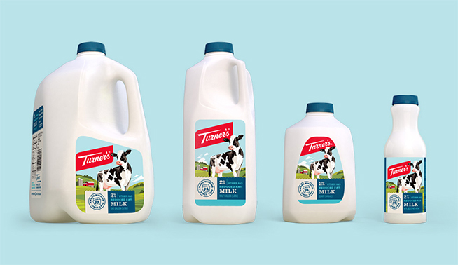
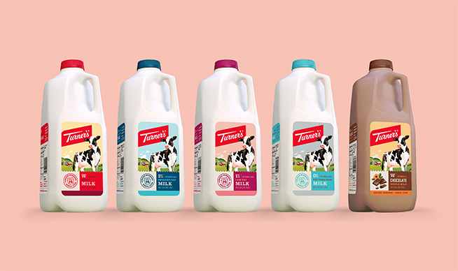
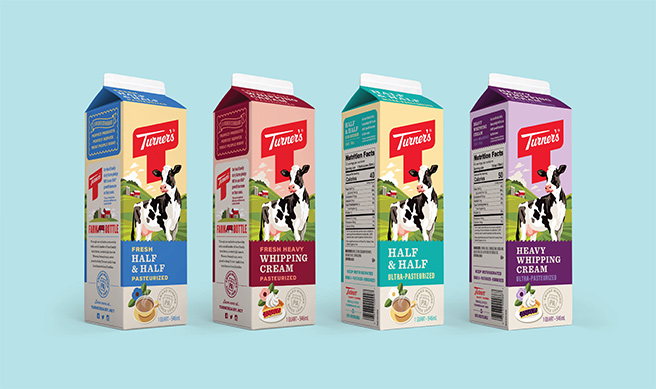
New labels and packaging designs for Turner’s fresh milk line of products highlight these changes. A WPA inspired illustration speaks to Turner’s brand history, agricultural roots and passion for setting a higher standard of quality from the farm to the bottle. The eye catching designs also help position Turner’s products to stand out at the point of purchase.
“All members of the Turner Dairy family, from our local farmers to our local team members are extremely happy to debut our new labels as part of our brand redesign. The illustration and visual cues in the label design maintain the ‘Turner’ heritage and image and we’re proud to bring them to market to share with our dedicated supporters.”
Consumers will also notice an update to Turner’s corporate brand logo(s), including both the Turner’s “T” logo and the Turner’s “script” logo.
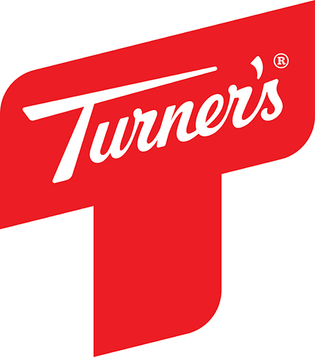
ABOVE: Turner’s New “T” Logo
The updated “T” logo is a strong and simplified version of the longtime logo and closely resembles the company’s original “T” logo.
![]()
ABOVE: Comparison of the New T Logo (Red) and Previous Version
“We’ve cleaned up the Turner’s Script logo to make it easier to read and easier to reproduce both in print and digitally. It’s a change not many consumers will even notice, but a necessary one in the digital age. Visually the new Script is an homage to our company history,” notes Turner.
![]()
ABOVE: New “Script” Logo
![]()
ABOVE: Comparison of New Script Logo (Red) and Previous Version